SCAN
Q1/Q2, 2021

ROLE: Product Designer
RESPONSIBILITIES: User Research, Strategy, UX, Rapid Prototyping, Visual Design and Quip writing
TEAM: 1 designer, 8 software engineers, 1 PM
DURATION: 4 weeks (Summer 2020)
Scan is a press and hold activated feature that attaches meaningful information on any object or product the camera points to.
Snapchat users can use the feature to identify dog breed, species of plants, nutritional information about the plant to overlaying AR figures over a flat surface.
How might we improve the current scanning experience from activating the camera to organizing all the information attached to the scanned object?
PROJECT OVERVIEW
What was the problem?
Scan is a new press and hold camera feature launched in 2019 as an effort to build a foundation for a rich AR utility platform. With more than 75% of Snap's 186 million users engaging with lenses, it's no doubt that Snap has placed a huge development effort on scan.
However, for new users, they found it difficult to utilize the capabilities of Scan since it's a press and hold activation feature that's buried within the lens smiley icon and there's no current interaction paradigm to inform users about this feature, resulting in low activation rate and poor engagement. Experienced users who have been familiarized with scan also voiced needs to revisit scan information they like and inaccurate scan results also frustrated them. For example, they might scan a pair of Adidas running shoes but with returned information of Nike's running shoes.
With limited sharing capability and imperfect scan results that frustrated users, I have taken the initiative to identify pain points of improvement while syncing with the ML perception team to understand users needs and documented users' journey when using the feature. With so many features that could potentially improve the feature, I worked closely with the PM to identify product roadmap and high priority projects that can create the highest business impact for Q1 and Q2 2021.

Solution
The project consisted of multiple weekly design sprints with which each week I took the initiative to understand some future UX improvements on the roadmap and took time to formulate hypothesis, design goals and explored multiple design options that could best address users needs and improve scan's discovery, ultimately maximizing users' usages and retention.
Some features I have proposed and pitched to the Scan engineering team included Scan Feedback (Q1, 2021), Scan Home (Q2, 2021), Scan Education (Q2, 2021) and Scan Send (Q1, 2021) that was eventually put into the roadmap.
The goals of the feature was to increase scan query actions, users' engagement with different utility lenses, feedback submission rate and ultimately expand the current scan feature to create more utility and functions for users.
FINAL RESULTS
SCAN FEEDBACK
One of the high priority scan project I have designed was a scan feedback flow that improved the reliability of scanning by enabling users to submit wrong scan results to Snap, so that the camera can improve reliability from users' feedback and ultimately boosted the accuracy of the computer vision algorithm for users.
By incorporating a feedback icon in the scan result card, we can begin to assess the credibility of the feature and surface correct and meaningful results to the users. Important metrics like submission success rate and retention can be used to gauge function's success.

SCAN HOME
It is common for users to save scan and revisit those scans they are interested. In external usability testings, 65% of users expressed the needs of going back to scans they like and view more information about it. For example, one user wanted to learn more about the dogs' breed but didn't have time to do so while he was performing scan on the spot.
Thus, I proposed, designed and created a visually polished home feature which leverages the existing scan pill's real estate as the entry point for viewing things users scanned, accessing scan history and saving scans they like.

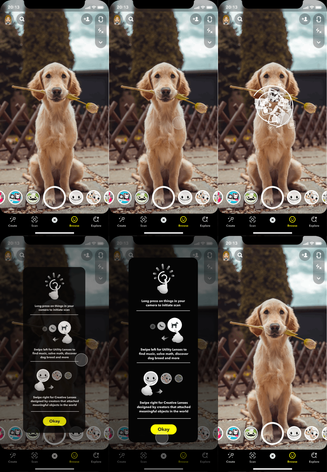
SCAN EDUCATION
From data analytics, I found that majority of the scan query's first action (93.3%) has shown no result, suggesting many users didn't have sufficient knowledge about what scan was and had no idea to point to their surroundings to get scan results. On the other hand, there was a tremendously greater proportion of swiping in carousel than scan query actions (23.2 >> 1.5 per day), also implied users' poor understanding of the difference between creative lenses (specifically for scan) and normal lenses in the carousel.
With the data in mind, I designed two versions of First Time User Experience that will be used for A/B testing on 120 million of users worldwide that helped users to understand the initiation of scan feature. Then, first scan query actions will be measured to gauge feature's success.


Note: old scanning micro-interaction was used to be compatible with the current app version
Full Design Process is protected by confidentiality agreement/ NDA
Because of the confidentiality nature of my work, I am not able to share more information about my design. Feel free to reach out to my email and I would love to hop on a virtual call to talk about the full design process. Alternatively, please enter password by clicking the link down below to see full case study deck.